20/01/2018
BLOSSOM
(A)
Blossom :
Natural Elegance in Every Drop
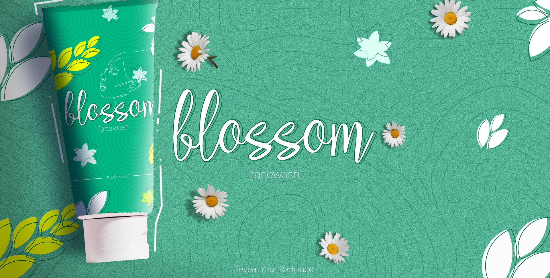
Blossom is a beauty product brand dedicated to providing high-quality skincare solutions. This report outlines the design process and considerations for the packaging of their new facewash product, aiming to capture the essence of the brand while appealing to the target market.
Concept Development
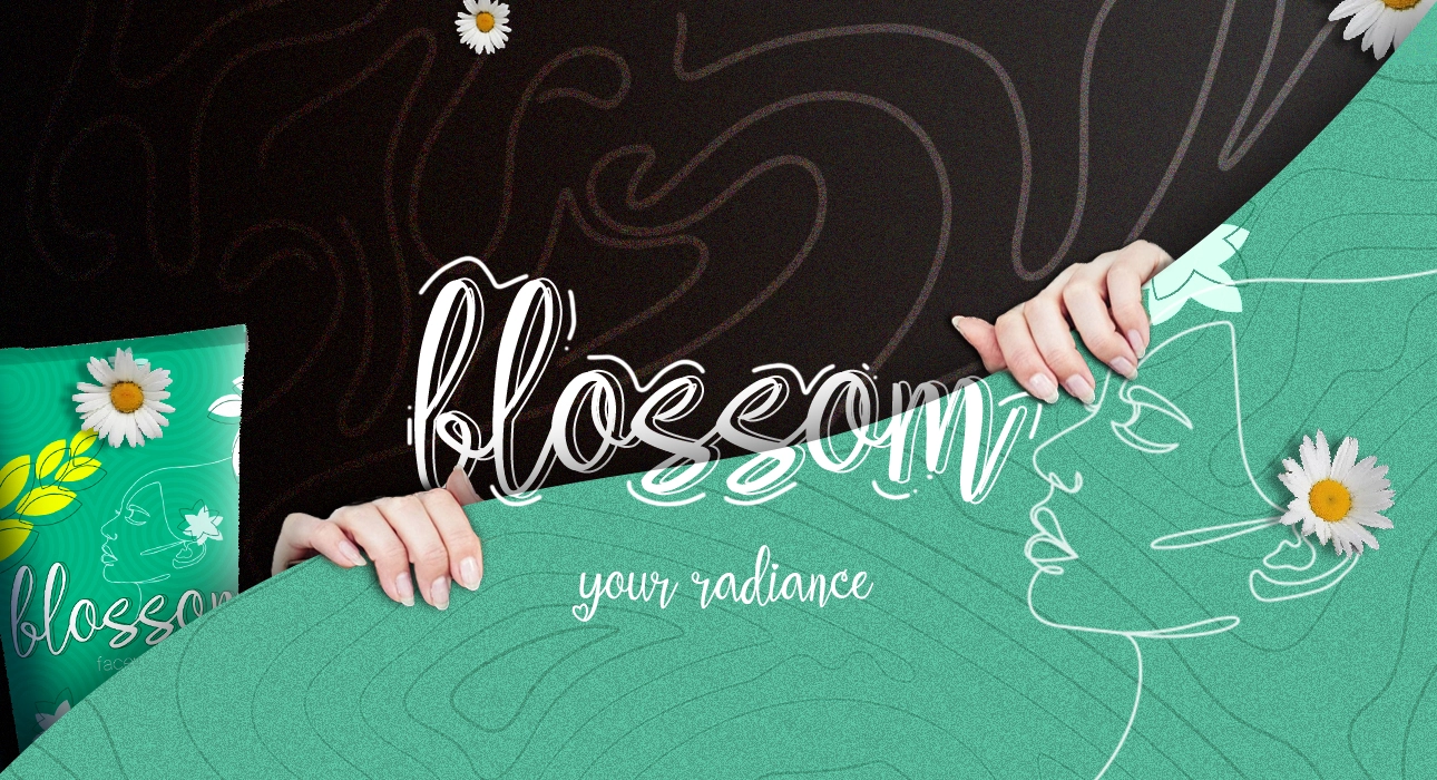
Three design themes were developed: Botanical Beauty, Minimalist Elegance, and Vibrant Freshness. The "Botanical Beauty" theme was chosen for its alignment with Blossom's brand.
Detailed Design
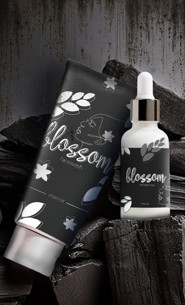
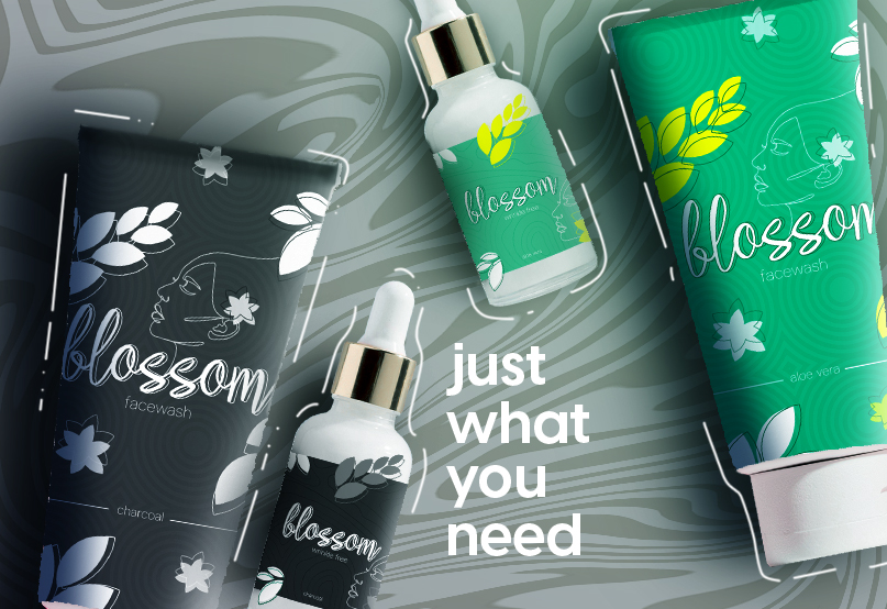
The chosen color palette includes soft pastels like mint green, blush pink, and lavender, complemented by white to evoke tranquility and natural beauty. A clean sans-serif font for "Blossom Facewash" ensures readability and a modern look, with a serif font for additional information. Delicate floral illustrations symbolize natural ingredients and integrate subtly into the design. The user-friendly layout features clear sections for the product name, description, and usage instructions, with key information highlighted for easy decision-making.
BLOSSOM
Story
Telling
Beyond visuals, the tactile experience of Serenity is thoughtfully designed. The feel of the premium leather, the smoothness of the zippers, and the attention to craftsmanship all contribute to the overall brand experience.
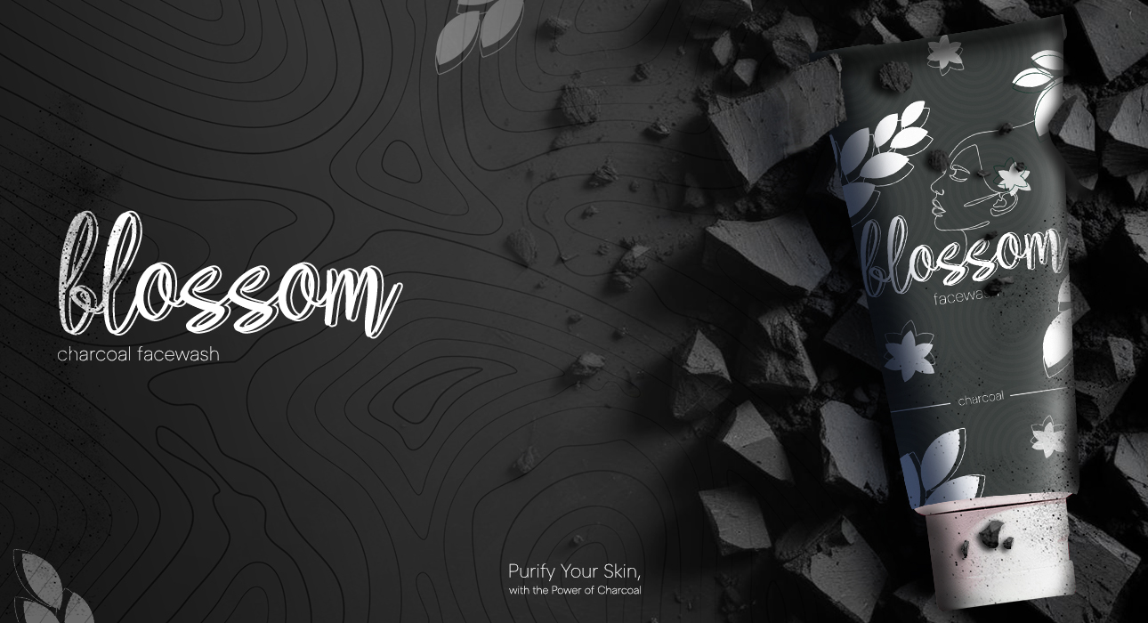
The Blossom Facewash packaging design effectively captures the brand's essence, appeals to the target market, and demonstrates a successful blend of creativity and practicality. This project showcases a comprehensive design process, contributing positively to Blossom's brand image.


