20/01/2018
SYNERGY

(A)
Energizing the Brand: Synergy
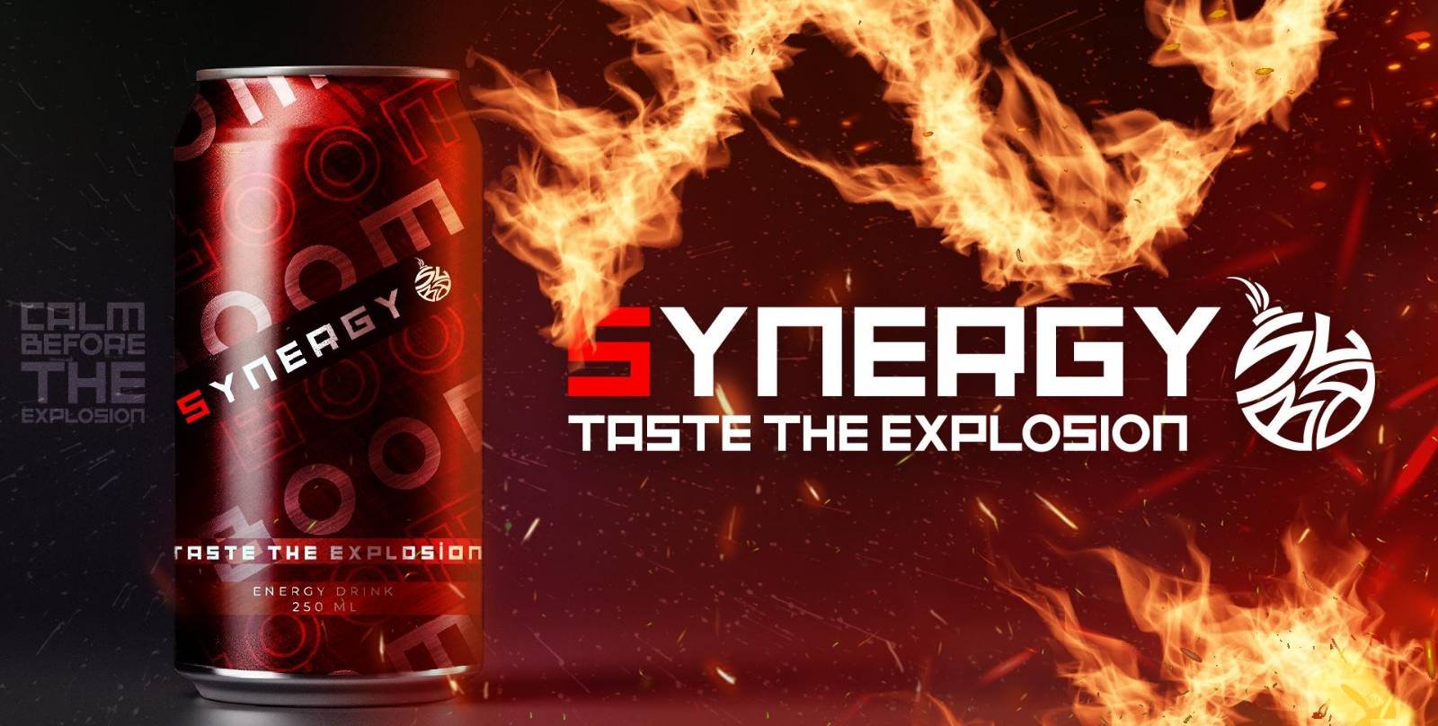
As designers, our task in developing the brand for Synergy energy drink involves creating a vibrant, dynamic visual identity that reflects the essence of vitality and performance. Synergy aims to stand out in a crowded market, appealing to consumers who seek both energy and a sense of community.
Visual Identity
The visual identity for Synergy revolves around bold, energetic colors and dynamic shapes that convey movement and power. We selected a color palette that includes electric blues, vibrant oranges, and neon greens to evoke a sense of energy and excitement. These colors are complemented by sleek, modern typography that suggests speed and efficiency.

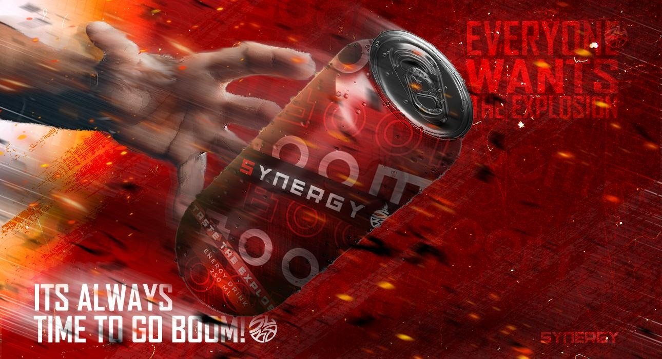
Packaging is crucial in the energy drink market, where shelf appeal can significantly influence consumer choice. Synergy’s packaging features bold, eye-catching graphics that stand out. The can design includes dynamic patterns and high-contrast elements that create a sense of motion. The materials used are sleek and tactile, providing a premium feel while also being practical for an active lifestyle.


SYNERGY
Story
Telling
Beyond visuals, the sensory experience of Synergy is carefully crafted. The sound of opening the can, the fizzy texture, and the invigorating taste all contribute to the overall brand experience.
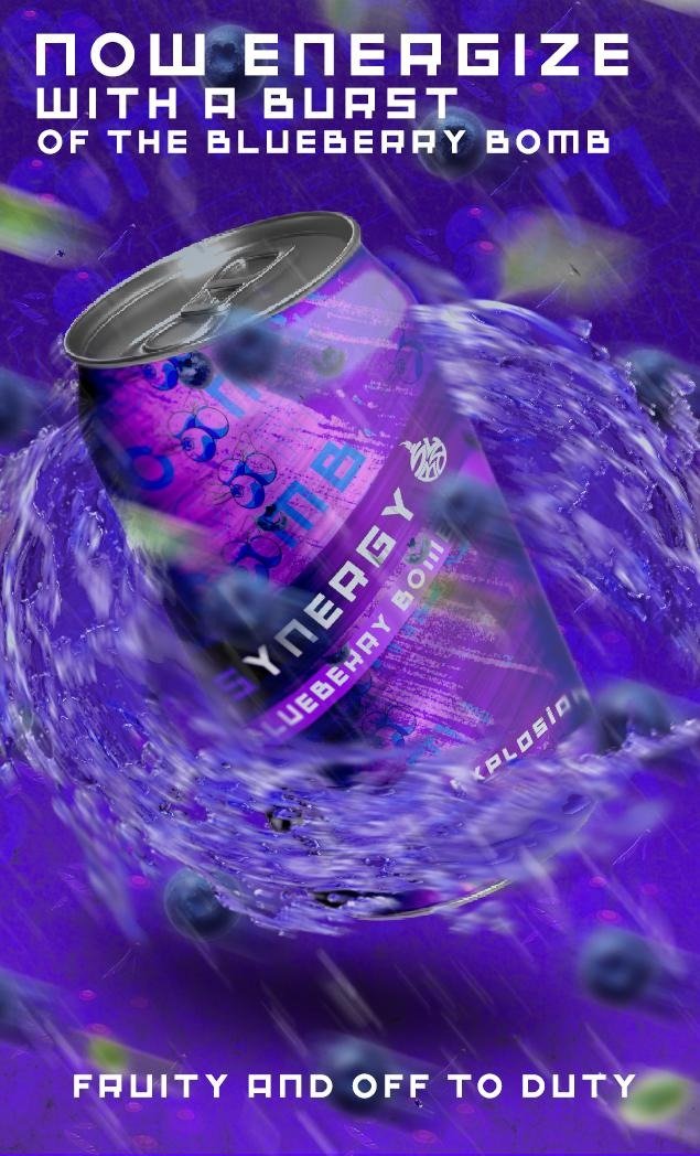
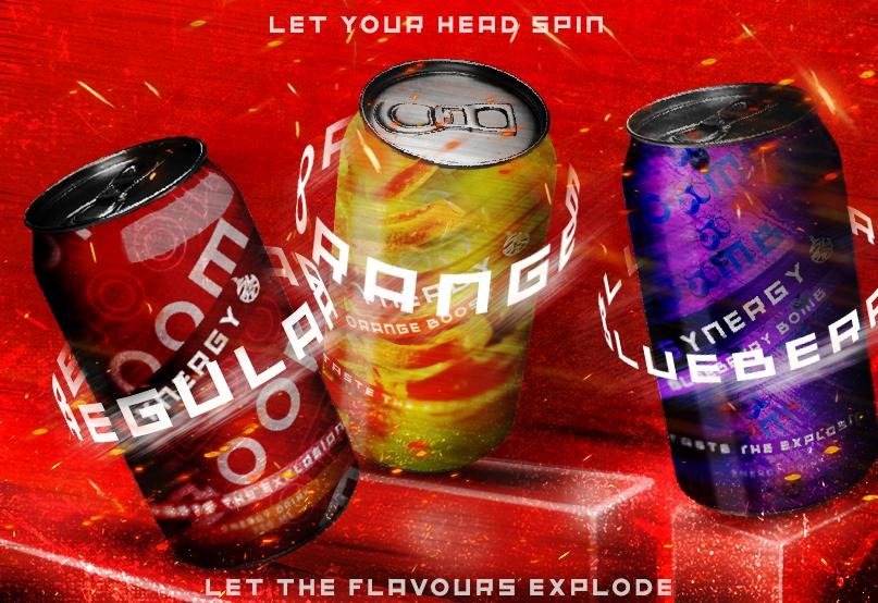
Each flavor variant is designed to provide a unique but consistently energizing experience, reinforcing the brand’s core promise of vitality and synergy. Branding and designing for Synergy involved creating a powerful visual and sensory identity that stands out in a competitive market. By focusing on dynamic visuals, engaging storytelling, and a cohesive user experience, we crafted a brand that not only delivers energy but also builds a community around performance and synergy.


